1
Whodunit
Welcome All-Stars to your first task of the season. This challenge is meant to test your creativity and understanding of theme.
For your first task; I'm asking you to take inspiration from both film-noire and neo-noir. In doing so you will create a cohesive and structured design. Vague but powerful task; use this to show me and your competition what you're made of. Good luck.
(Please note, only the TOP 2 will be edited into the cover photo. Your designs will not be edited as shown above.)
PHOTOSHOOT
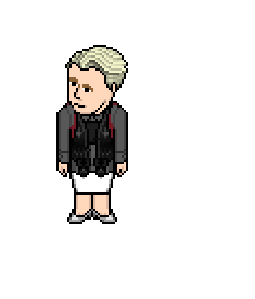
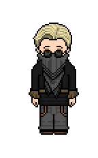
Majesteux

It's nice to see your fashion sense hasn't diminished. This is a very intriguing design. The shirt coloured that way is genius; I'm not sure many people have caught onto that. Very crafty. That being said, the use of black is excessive; in a task where you could have gone any direction, it would have been nice to see you play with colours and layering rather than cover the entirety of the design in black to hide the unwanted lines. Overall a nice design to start your portfolio. Very safe; you're capable of pushing boundaries further. Welcome back.
Pippaz
You've been vouched for as a designer this season; a lot of speculation as to how well you would do has been brought up. Unfortunately this didn't impress me in the slightest. I thought this was your everyday outfit when you told me it was what you were submitting. I hardly see the relation to the task and find this to be far too simple; it pales in comparison to the rest of the designs this week. The contrast of colours in the bodice are overbearing. Though the green does mellow the design to a more even tone, it still draws the attention away from the rest of the design. Thanks.

Issus
This is strikingly beautiful. The silhouette is something I feel I've seen before; however it works wonders in this instance. I find the layering and balance of shades to be very admirable and it stimulates the passion I know you have for designing. The red stripes illuminating and hugging your torso are definitely show stopping. They tie both the neo-noir aspect of this task to the film-noir aspect. Well done. I'm thrilled to have you compete in my all-star season. Thanks.
Lidl-Wayne
I love that you have decided to add patterns and layering into your design. For a simple task; the obvious route was to go simple. You've exceeded my expectations; especially after CorpeTerm. I'm intrigued to see how you go about an All-Star season. The red is gorgeous to look at, very powerful. I could have done without the belt; perhaps adding a different layering approach would have been more palpable. Nevertheless, a nice design. Welcome back.

Jozinga
This is eye-roll inducing. I appreciate the effort. I think this is a bit excessive. The jacket was a smart design choice especially with the ruffled effect you've added in the bodice. The palette missed the mark for me. I think because the palette is so dull; it takes away from all the smarter choices you decided to do. Overall not a complete miss but it just didn't reach the level I wanted it to for this week. Thanks.
RiverStonePeach
You have executed this task very creatively. The use of pattern and texture in the chest are not only structured but they play off of the aspects I was looking for in this task. The creative streaks spiralling down the bodice into the lower half of the design are quite immaculate. Finally, the blood orange shoes are a gorgeous addition. Overall a very smart choice and execution. Thanks for a great week.

Vyia
You played it very safe this week, maybe it's a strategic prowess or maybe you just don't know how to push boundaries. That being said I do enjoy the structure and the palette. The cut out in the midriff is refreshing to see especially with the layers you added. Overall a nice appealing design, a bit average. Thanks.

Barbuda
Boy George wants his wardrobe back. This is very dated and uninspiring. I find the relation to the task is non-existent. You were so focused on the illusion of black in the top half of the design and the gradient change in the lower half that you negated to show me what you're really made of. The green shoes may have been your saving grace. I know you're better than this and I can't wait to see you break the boundaries I know you're used to doing. Thanks.

Snawl
You seem so proud of this. Unfortunate for you, I think you're more proud of your explanation than you are the actual design. If I deconstruct this design. I see an average and overused layering of fabrics, a minimalistic approach to a palette and a focal point; being the goggles. You've managed to create a daring design that does relate to the task; I just wish you executed it differently. Overall, not the worst but not the best by far. Thanks.

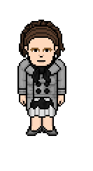
MickyRicky
I was looking forward to seeing you shape your path in this competition. Combining new style with old style fashion. You've managed to produce such a drag-queen approach to such a powerful and constructive task. I don't see how this relates to the genres and the design is so overbearing. If you manage to stay this week I hope you're able to flip the switch and show everyone how good you really are. Thanks.

WartortIe
This is very inspiring and fundamental. I think in terms of fabrics and layering; you were one of the better designs this week. The unorthodox pants were used in a very clever way. I see this being very fashion forward; I wish you added some pumps instead of a flat shoe to contrast such a heavy design. Overall the palette and structure worked wonders and you played it really smart this week. Well done.
icearbr
The layering is impeccable. The way in which you coloured the pants to match the aesthetic of the torso in your design was clever. I enjoy how disjointed the design is but how it still manages to connect and create unity. The headpiece was also a nice touch; relates to both aspects of the task. Overall a very powerful design this week.

SofterWorld
Before describing your design; I was able to see what you were going for. Sometimes things are better left unsaid, let your designs speak for themselves. The black; though excessive, somehow it managed to work. I enjoy the different textures. Overall a safe design. I wish you played with fabrics and different ways of portraying your ideas. Thanks.

Xenid
The bright contrasting colours are very loud. I think that is what makes this design intriguing. I love the way the jacket cuts at different places to create such a uniformed piece. The scarf is gorgeous and matches the rest of the design precisely as it should. Overall you've managed to create a very constructive piece that speaks for itself and relates to the task beautifully. Good job.

That brings the first part of WEEK 1 to a conclusion. The top 2 this week are ISSUS and RIVERSTONEPEACH. They will face-off and re-do the task using a new approach to see who will claim the top spot of the week. The winner will send either MICKYRICKY or PIPPAZ packing. Once again; you create your own path in this game and seal your fate. This isn't the end for the bottom 2; you better fight for that spot. Good luck!
24 HOURS TO RESUBMIT
Issus
VS
RiverStonePeach


In terms of competition; the 2 of you are extremely different in stylistic approaches and the way in which you interpret a task. Very interesting results in this re-do twist. Overall I'm going to hand the win to ISSUS. I feel as though you stayed true to your original concept and elaborated on your efforts as a designer this week. This would still hold as a top design for the week. Well done. As a reward for your efforts you were granted the privilege of sending either MICKYRICKY or PIPPAZ home.
The designer that you have decided to get the chop is . . .
MickyRicky
"I flipped a coin, I really don't care who leaves at this early stage..."
Thanks for everything you have done for the community Savon. You've inspired this generation of designers; you've inspired me. You are and will always be an All-Star.